Monday, May 1, 2017

The fundamental aspect of modern design is clean, open, and simplistic in nature. Modern design is very functionality focused. It also goes above and beyond what is usually thought of. Modern design allows designers to come up with amazing, and unique things.  There are many types/ styles of modern design. Some popular ones include minimalism and art deco. Art is heavily influenced by modern architecture and interior design. For example, the Art Nouveau movement and the Tassel House by Victor Horta. Modern designers took art which included paintings, drawings and sculptures and put that towards there design concept. As students in studio, we do this too. We come up with a drawing using principles and elements, and then incorporate the drawing into our design. Modernism was inspired by art and also was about making good design for all people. Good design for all people would include people with special needs. Federal regulations then ordered that bathrooms, sidewalks and buildings have to accommodate people in wheel chairs. Modern design ranges from a large time frame.


The year that Modernism came about is still debated. Some say it started as early as the 19th century. The 19th century was based off of revivalism. Mainly Greek and Roman. Specific styles that were used the most in the 19th century were the Beaux-Arts Style and the Greek Revival. Another style that was used a lot was Gothic Revival. This was used for churches, universities, cemeteries, and even residential. The technological advances of the 19th century were shown through the architecture. The industrial revolution was such an important time for specifically architecture. The technological advances made designers able to make buildings that were once dreamed of before then. The mid to late 19th-century became notable for the introduction of skyscrapers. The first skyscraper made out of steel was built in Chicago. This paved the way for taller and taller buildings to be made.  


International style is characterized by the use of materials such as concrete, glass, iron, and steel. This style came about during the formative years of modernism. It is focused on functionality instead of decorative details. But, it still shows artistic expression through the use of principles, elements, scale, and materials. The designer Gropius shows International style in his pieces. In the Gropius house, he uses basic materials of International style which were concrete and steel. Again, in the Bauhaus, he uses concrete and glass. Another popular designer named Frank Lloyd Wright, showed International Style. Through the use of wood, horizontal shapes, and neutral colors, he tries to connect viewers to nature. Alot of modern design tries to connect the viewer to nature. Many designers do this through using large glass windows. Every modern designer may have a different idea that they want to convey. But, just because their style is different from others, doesn't mean that it's not considered modern. 


Sunday, April 30, 2017

Furniture is one of the most important parts of a room. Furniture provides a place to sleep, eat, relax, etc. Everyone knows what furniture is. When you walk inside a space, you will almost always find furniture as soon as you walk inside. For example, when you walk into a public space, you will usually find a front desk. The front desk is an important part of the space because it serves as a space for many different functions. Good furniture is multi-functional. An example of that would be a chair with a table and cup holder attached to it. Good furniture is comfortable. Anthropometrics are important for the furniture to be comfortable for human use. It has to match normal human scale. Comfort is something most people sought after in furniture. When someone wants to buy a couch or bed, they always sit on it to test it’s comfort. Another important thing in furniture is its durability. If the furniture has durable materials and finishes, then the piece of furniture will last long. Furniture is also about aesthetics. The look of furniture helps to tie together the overall look or theme of the room.


Materials make-up the basis of the built environment. Popular materials include brick, metal, drywall, concrete, etc. Materials and finishes are very similar things, that’s why I will be combining these two topics together. Finishes include things like paint, carpet, coatings, tile, wood, etc. But those things can also be called materials. Basically, these two terms are interchangeable. Materials/ finishes are what you see, feel, and walk on in a space. They are very important in design. Materials and finishes are both functional and sometimes aesthetically pleasing. They add importance to the overall function of an interior/exterior. They also help make a space achieve its overall look and feel. When picking a finish/material, there are several things a designer has to consider. One thing would be price. The price of a project is important to clients, so designers must pick materials that aren’t very expensive. That’s where faux materials/finishes come in. Hard plastic countertops that are made to look like granite are a good example of this. Another example is brick wallpaper. Brick has become more popular for interiors, but, it’s somewhat expensive for a client with a lower budget. Vinyl is a flooring that is cheaper than real wood but some types of vinyl are actually made to look like wood. Durability is an issue that designers must think about when picking materials/ finishes. Vinyl may be cheaper but real wood will hold up for years and years. After the wood stain starts to wear off, it can be repainted again and again. Another very durable material for an exterior would be brick or even concrete. Another important consideration to make when choosing a material would be safety. An example would be at a pool. The deck becomes slippery when wet so designers need to choose a flooring with a grainy and non-slick finish.


Representation can mean different things in design. One thing is how a design concept is formed. When a client wants a space designed, it needs to represent their brand. For example, a coffee shop wants their atmosphere to feel warm and welcoming, as well as represent their values, through the design of their shop. With the invention of virtual reality, a design can be showed to a client as if they were seeing it in person. This is changing interior design because you can experience your design concept in 3-D. This can make your design even better and make the client able to give even more feedback. 


Saturday, April 29, 2017

In this putting it together post, I will be talking about principles and elements, light + color, technology, experience, and scale. The principles and elements of design can be used to describe just about anything around us. They could be found in man-made objects or from nature. Principles and elements are the basis of design and art. When you analyze design, you look at the key points of the design. Therefore, understanding the principles and elements in design is crucial in order to analyze art and design. All designers use elements and principles. Good designers utilize different elements together to form a product. In most designs, such as interior design, you will find line, form, color, light, and harmony. In my projects in studio, we almost always drew an abstract piece that would utilize principles and elements. The drawing would then be integrated into our design for other aspects of the project. Even some of the earliest buildings made showcase principles and elements, such as The Great Pyramids of Giza in Egypt. You can see that line and form are most prominent there. As well as emphasis on the face with texture and shape. The shape of the triangular pyramids are symmetrical. In the pyramid, you will see proportion between the statue and the pyramids.


Scale is very important to design. The objects designed must be usable for humans. For example, a couch is scaled to be used for people to sit on comfortably. If the couch is too big, then people would have trouble getting on the couch. Scale for exteriors is also something that can be important to the design. A large building can be large for many reasons. One reason would be to represent something or someone. For example, the Salisbury cathedral, and other cathedrals, represent faith and God’s glory. They are made massive because they represent something big and important to groups of people. They also show the creativity of their time period. In terms of urban scale, the buildings size is very important. For example, in New York City, they have lots of restrictions on how large a building can be. Not so much the height, but the width of the building is very important so that one building doesn’t take up too much space. A building can be analyzed and described by scale alone. If a building is very tall you could speculate that the building is used for many different things. You could also assume that the building is important if it’s very large. In an interior if an object or space is large, such as a buildings’ atrium, you will know that the atrium is an important gathering area for people. This idea goes back to that humans and scale are taken into high consideration in design and are one of the most important things in design and in describing design.


In ancient times, technology was basic compared to today. There were basic technology pieces such as a calendar and books. As time went on, technology kicked off. Roman architecture particularly stood out because of the arches, long lasting concrete, and aqueducts. The National time period, was a big change from The Ancient time period. New building materials such as steel were being used. Transportation such as railroads came about. Also, new energy sources such as light were introduced. Modern times has yet again brought new materials. Architecture is starting to take the environment into consideration. LEED certified buildings are being implemented. Technology today, is changing interior design and how designers can design spaces for clients. For example, virtual reality allows you to see a room like you would in real life except it is digital. The client can personally experience what their room will look like before actually remodeling or making the room. Technology has also changed the way designers and clients communicate. Instead of describing or drawing what a potential room could look like, designers can make it on their computer or tablet and show it practically in real life form. 


  Technology, light + color is connected in a few ways. Lighting is a technological advance itself. In 1878, Thomas Edison invented the lightbulb, and then it was used for many years solely for functionality. But, nowadays lighting is both functional and can be aesthetically pleasing. For example, Christmas lights are decorative as well as lamps. There have been some notable new developments for lighting throughout the years. For example, a recent invention is that there are sheets of plastic that can be put on your walls and used as lighting. There’s also lighting inventions that look at how to save electricity. Passive solar design minimizes energy use by saving energy through the use of solar technology. Technology like this poses new opportunities for saving money on bills and it helps conserve energy. Light changes the color or look of things. Natural light vs artificial light will have a different color to it and therefore objects in a room may look a different color. Color in interior design is important because it sets the feel of the room. Color needs to be strategically placed in order for it to look good. For example, you shouldn’t have many different colors in one small area, or it will overwhelm you.


What you see, feel, hear, touch, encounter, all contributes to your experience of a space. The experience of the user is a very important aspect of interior design. The topic of experience in design is a more advanced aspect of design compared to others listed above. It requires much thought by the designer. Designers have to take many things into account when designing for the user’s experience. Because, in order for a person's experience in a space to be enjoyable, the space must be designed correctly and well. For example, at a shopping mall/store, there must be enough space for people to move around without bumping into each other. In a place such as a shopping mall, the user experience is important for a variety of reasons. One reason would be that they want people to remember how nice the place was so that they come back. The goal is for users to have a pleasant shopping experience. An example of an experience oriented place is Disney World. It’s a place that the user is supposed to feel like they are in a fantasy world. Disney world is all about entertaining (of some sort) and the designers worked hard to convey this “magical” place. 


Thursday, April 27, 2017

Climate change, pollution and other environmental issues are largely due to human behavior. This is an ongoing issue that isn't talked or thought about among many peoples' daily lives. For example, some people deny that there's a climate change going on, even if its right in front of them and happening where they live. Other people may not care enough to acknowledge the problem. Some people may recycle, or they may be too lazy to recycle so they just throw it away. Designers need to be aware of all of these issues and they also need to be aware of the impact of buildings. Reducing energy use is very important. Fossil fuel based energy plays a huge role on the environment. As designers, we can come up with alternative solutions for reducing energy consumption. Things like automatic lights that turn off, and solar panels, make a huge difference. If designers do this more and more, that will help our environments future.

Thursday, April 20, 2017

Sense of place means different things to different people. The kind I will be talking about is the spiritual one. That means ones feeling of belonging. For example, one could feel drawn to a certain area, such as a beach town. They could feel as though they belong there, so they choose to be there.

Tuesday, April 18, 2017

branding


This brand follows a strict color scheme of green and brown. The design is very simple. As you can see, it is half green and half brown. The main shape of it is a square. The square makes up two different triangles because of the color. You can tell this is a professional business. This is because their branding design is very simple and "clean".

anthro

The seat I will be talking about is my seat in my room. This seat is unsuccessful to fit for humans. It is very uncomfortable to sit in. Making it hard to sit and do homework at my desk. So, I don't sit in this chair because it is so uncomfortable. The seat is short in height, which makes you have to bend you knees quite a bit when you sit in it. The back of it is made of a cheap plastic liner that is supposed to support your back. The chair has metal parts that make up the structure. The metal sticks out and pokes your back, so basically you are leaning against a thin piece of metal even if you sit up straight. The liner is in the middle of the chair so that the metal is on top.

Sunday, April 16, 2017


The most basic of needs are safety and security needs which is 2. Security needs and 1. physiological needs. The technological advancement of a lock on the door, provide safety and security. A home also provides those things. Other basic things such as rest, are needed to survive. In order to rest properly, you need a bed, and a chair. Preferably, those things would be made out of a comfortable padded material. 

Saturday, April 15, 2017

The design process + aging materials

"The Design Cycle" is made of 4 steps. Investigate: identify the problem, plan: plan/design the solution, create: create whatever you are making, and evaluate: evaluate how the design works, do testing, improve things for next time. I agree with brands' thesis about how some materials change more quickly than others. For example, brick is pretty resilient compared to cheap lap siding made of a plastic material. Brick lasts longer than the lap siding. Other things that are resilient are bucco, stone and metal, these are very long lasting materials. All of these materials will give a building a different look of course, and some are more neutral than other in terms of fashion.

Thursday, April 13, 2017

Representation can mean different things in design. One thing is how a design concept is formed. When a client wants a space designed, it needs to represent their brand. For example, a coffee shop wants their atmosphere to feel warm and welcoming, as well as represent their values, through the design of their shop. With the invention of virtual reality, a design can be showed to a client as if they were seeing it in person. This is changing interior design because you can experience your design concept in 3-D. This can make your design even better and make the client able to give even more feedback. 

Sunday, April 9, 2017

Memorial Hall

This mural is very large in scale. As you look at it, you can see different things happening. There are different pictures that capture a different moment in time. These different stories were all placed in Central Kentucky. It shows what life was like at that time. You can see to the top left a depiction of downtown Lex, and those buildings are still there today. I think it’s interesting how there are a lot of building being made out of logs. On the bottom half of the mural, it looks like it’s depicting an earlier time than the top of the mural. I wonder if that is on purpose?  Different things you will see are women doing laundry, slaves working, men building things, town gatherings, people dancing, and people traveling.

              This mural makes me feel curious as to what each day was like for these people. Who liked living here? Who didn’t? What did these people do for fun? What kinds of fun events happened in Lexington during this time period? This mural in memorial Hall serves as a dedication to those who died in WW1. I think this piece is a good piece of history. 

Thursday, April 6, 2017

World fairs present new architecture and design ideas to the public. New technology is a huge part of world fairs. They also bring new furniture, and lighting ideas. New furniture also means new materials. In the Great Exhibition of 1851, the crystal palace is a good example of new technology and materials being incorporated into design. This place used iron and glass which allowed natural light to come in. Designers then can incorporate these new ideas into their own design. The New York worlds fair of 1964, produced a unique experience for viewers. It was called "Peace Through Understanding". Users felt as though they were in a futuristic place with the different things that were found at the fair.

Monday, April 3, 2017

When you think of the word fair, you think of something like a county fair with food, amusement rides, and games. But worlds fairs/expositions are more about showcasing achievements. Worlds fairs were more popular back in the 20th century. They focused on inventions such as architectural, artistic, and technology. Today, they focus more on other things such as improving the hosts' countries' image. I find it interesting how at the fairs they build buildings for it and then showcase them. Some of the buildings built for the fairs are still standing today, which is something that is very interesting.

Sunday, March 26, 2017

This is inspiring because of how it mixes different patterns and different colors against plain furniture.


This storyboard is inspiring because of its uniqueness of colors and fabrics.


This is inspiring because it includes a variety of similar but different design ideas with similar colors.


Palladio's work was so influential that there's a style named after him which is called Palladianism.
The building shown is an example of palladianism. Most palladianism buildings have symmetry, proportion, and a temple front, like the picture shown above. Palladio wrote the four books of architecture, which inspired many architects and engineers. Palladianism can be seen around the world. The white house would be an example which shows palladian motifs.

Furniture is one of the most important parts of a room. Furniture provides a place to sleep, eat, relax, etc. Furniture provides an experience for the user based off of its look and/ or function. The look of furniture helps to tie together the overall look or theme of the room.

Thursday, March 23, 2017


Picture #2 has unique furniture that stands out. The furniture is a focal point of the room because the rest of the design is rather simple. Picture #3 has a complex design. The strange color combination and the complex stair case make this room unique. Picture #4 is my favorite of the rooms. The blue floor adds a touch of character to the room. The black trim adds character to the overall look of the room as well as the grey wall. 

Representation can mean different things in design. One thing is how a design concept is formed. When a client wants a space designed, it needs to represent their brand. For example, a coffee shop wants their atmosphere to feel warm and welcoming, as well as represent their values, through the design of their shop.

Thursday, March 9, 2017

Image result for white bed

My favorite piece of furniture is my bed. It is a place that I do my homework, sleep, and relax. My bed at home is the most comfortable furniture piece in my opinion. If I have friends come over we will sit on my bed and watch tv, hangout, etc. A bed is the most important part in your bedroom.


The 90 offers comfortable seating and then less comfortable seating. The chairs on the right are grey and plastic with metal legs, making the chair modern. The modern chair goes along with the rest of the rooms design. The room is modern with a neutral color scheme and pops of color such as UK blue. The room is designed well because it is open and has lots of space for many people. The chairs to the left of the picture are upholstered with a simple pattern on the back of it. The seat is cushioned which provides comfort.


Image result for uky campus dining

Image result for uky starbucks

The starbucks on campus is large and accommodates many people. Something that should be changed about the design is the workers area. It seems very very small and hard to work with so many people behind the counter. The majority of the chairs are wooden and have seat padding for comfort. There are even more comfortable chairs such as leather cushioned chairs.


Tuesday, March 7, 2017

Image result for lobby of le sirenuse


The lobby of this hotel is my favorite for a few reasons. I like the colors which are the pink curtains, blue couch, and the green plants. The flooring includes a pretty tile pattern with blue, yellow and pink shades. The arches give the space character. The plants make it seem like a tropical place, and this connects the room back to nature. The white walls allow the viewer to pay attention to the furniture and finishes. The natural lighting adds vibrancy and light to the room.

Monday, March 6, 2017

This chair was made around when the Gallerio Vittorio Emmanuel II was built. This is a bright red sofa made of upholster. The upholsters finish is silky. The outlining is made of wood. The technologies of that time period made it so the chair could be upholstered. It would probably be owned by someone that was wealthy. The bright red sofa looks even more vibrant when light shines on it. The sofas size looks like it would fit two or three people.

Sunday, February 26, 2017


The 21 C has modern finishes such as marble flooring and walls. I felt a bit overwhelmed with the marble. On the ceiling, there is a beautiful and colorful lighting fixture that is 21st century modern. When you look into the other room you can see even more modern lighting that makes the room a purple/blueish glow. This space feels modern but also you can tell the building is older because of all the marble. 
              The Gratz park inn is definitely a cozy-feeling inn. It has dim lighting and comfortable couches and chairs. This building doesn’t feel modern.  It has wood flooring and the walls look like wallpaper or painted to look like wallpaper.  The patterned rug was outdated as well.  I also observed wooden furniture and trimming. The colors in this space were mostly neutral with a few pops of color here and there. The couches and chairs didn’t really match but they were somewhat close in color.
              These two spaces were mostly different. The 21 c hotel felt like a place for a fun and exciting weekend trip while the gratz inn could be a place to stay for a calm and relaxed weekend. A reason for that would be the finishes that were used. The 21C hotel had trendy finishes such as the lighting and marble while the inn had somewhat outdated finishes like the wall covering and some of the antique looking furniture. 
21 C Hotel


Gratz Park Inn
Finishes are important to experience because finishes make up interior design. For example, Disney world, as mentioned in the lectures, is a good example of an experience oriented place. Disney world is a place that the user is supposed to feel like they are in a fantasy world. Finishes such as colors, and textures, all contribute to your "magical" time at Disney world. In the picture below, you can see how there is large art pieces on the walls. Colorful butterflies and other different animals are entertaining to look at while you are dining. Disney world is all about entertaining ( of some sort) and they make sure every building you go to does just that.
Image result for disney world interior design

Thursday, February 23, 2017

In the knoll video the lady pointed out an important part of design which is that design is about how you feel in space. In the lectures and in the knoll video they talked about how design is about an experience in a space. In the lectures a good example given was at Disney world and how design shapes peoples experience there. What many people don't realize is that interior designers can work for places like Disney world.
    Interior design and interior decoration are similar and different. Interior designers can both decorate and design a space. Decorators usually decorate using things such as lights, furniture, rugs, etc. As stated in the knoll article, designers address client needs. They look at what the space needs for the amount of people there are and where the space is located. Interior designers solve problems and they go through long design processes to get to the finished product.

Wednesday, February 15, 2017

The Art Deco And Art Nouveau period was heavily influenced by nature such as flowers. It was also influenced by a reaction from historicism. In the modernism period they embraced materials such as wood, glass, and iron.  Below is a picture that embraced wood and curved lines.
Image result for victor horta


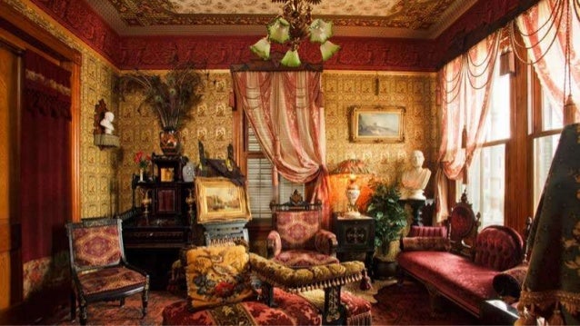
The victorian era was influenced and named after queen victoria. Wallpaper was used and soon became a trend throughout interior design at this time. The wall coverings would be patterns that would include things like flowers, motifs, etc. They embraced heating, lighting, running water, and toilets.

Image result for victorian era interior design


Monday, February 13, 2017

Large_front_baroque-m


The boroque period included colors that were bold. Religion was something that was highly influenced by this period. Motifis were used such as fleu de lis. Above is what the boroque period would look like.


A room decorated in the Rococo style, Nymphenburg palace, near Munich.
Rococo period had organic lines and shapes. Walls and ceilings were decorated with curves and ornamentation.


Image result for georgian interior design
georgian period was about entertaining guests. It had elaborate carvings such as ornaments. Colors were explored throughout this period.


Image result for neoclassical interior design 18th century
The neoclassical period would be characterized as an elegant period. I think this is one of my favorite periods. This picture above is a beautiful room that one would feel as if they were in an important and elegant space if they were standing there. The furniture was simplistic and the colors weren't overly bright.


The fundamental aspect of modern design is clean, open, and simplistic in nature.  Modern design is very functionality focused. It also goes...