The first place I analyzed was a small office and a large church. I talked about contrast between the two sizes of the buildings, which refers to the scale of them. Tehnological advances were achieved before the making of the tall church, such as: architectural and engineering advances as well as material advances. In the 2nd video (uploaded on canvas due to technical problems) I talked about the contrast between 2 materials on the Hunt Morgan House. The red brick against the white/ grey stone was a contrast between 2 materials and 2 colors. In the third video I talked about pattern. There was a pattern on the church's stained glass window. (this wasn't the same church as in the first video) When light hits the glass window, color will appear more vibrant. The color and the glass are both technological advances. The stained glass makes up color, line, texture, and shape.
Monday, December 12, 2016
Wednesday, December 7, 2016

The buildings' exterior is important because it's the structure of the building. It holds many technological advancements.


I found this table with plugs so that you could plug in something and charge it.
One of the most notable things I found here was the table with the charging station. Not only is this a technological advance, but it caters to people, because many students have laptops that they need to charge. This adds to the human experience in that you can simply charge your phone or laptop from a simple table. Other things that add to the human experience are the use of materials throughout the building. Metal and glass are used a lot throughout the space, which is a technological advance and it also makes the room sleek and modern. I found that the space produces a comforting but energetic environment through the use of the interesting lighting fixtures. The neutral colors, lights, glass, and other textiles, create a cohesion of a modern space that makes students' experiences a positive one.
Sunday, December 4, 2016

This technically advanced chair has neon lights that you're able to sit on. This chair is compelling because of the use of light that functions as a chair.

I find the use of technically advanced materials to be interesting. It's interesting how the designer chose to use faux leather and metal. These two materials come together and give the chair a sleek look.
Technology is changing interior design and how designers
can design spaces for clients. For example, virtual reality allows you to
see a room like you would in real life except it is digital. The client can personally
experience what their room will look like before actually remodeling or making
the room. Technology has also changed the way designers and clients
communicate. Instead of describing or drawing what a potential room could look
like, designers can make it on their computer or tablet.
Technology,
light + color is connected in a few ways. Artificial lighting is technology and
there have been new developments for lighting. For example, there are sheets of
plastic that can be put on your walls and used as lighting. There’s also many
other lighting inventions.
Technology
can be linked to other units we have had. For example, my case study building had
many arches which is a technological advancement. That can be liked to unit one
because of the lines of the arch, also there were different scales of the
arches. There were some arches that were smaller and the main one that was
connected to the opening of the building, was very large compared to humans. Technology
can be sometimes used to describe buildings, like if the building has lots of
technology. You could also describe spaces using their technological advancements
because technically, about everything in a building is a technological advance
in some way.
Friday, December 2, 2016
Technology being incorporated into textiles creates many new
opportunities for the usability of things. These new things that are being
developed such as wall coverings that control temperature, shows that
comfortability is important in interior design. I see positive outcomes with
the new technologies being created. For example, the Organic Light Emiting Diod
conserves 50% of lighting energy. The article also states how they are working
on a project to have plastic sheets of light, eliminating electricity usage and
costs. I don’t think new technologies will take away the traditional creativity
that interior designers have. If anything it will make them more creative in finding
the best materials/items relevant to their clients’ needs.
Tuesday, November 29, 2016


In the first photo you can see the large windows which are a type of glass which is a technological advance. The metal framing is an advance as well. The lights inside were once not there, they were added when the light bulb was introduced. Each of the buildings' characteristics are a technological advance. For example, the many arches and columns on the building. Other advances would include the materials used on the building such as stone and concrete. On the inside there are many materials such as the tile floor, the paintings on the wall, and the wall material itself. Other technological advances would be the plumbing, electric, and heat/air if there is any in the building.
Monday, November 28, 2016
Passive solar design minimizes energy use by saving energy through the use of solar technology. Technology like this poses new opportunities for saving money on bills and it helps conserve energy. Lighting is a technological advance itself. Lighting is functional and can also be aesthetically pleasing. For example, Christmas lights are decorative as well as lamps. Light changes the color or look of things. Natural light vs artificial light will have a different color to it and therefore objects in a room may look a different color.
Sunday, November 27, 2016

Technology and light+color are used in picture 1. Natural light comes through the large window. The window is framed with a technology such as steel or iron. Technology can be seen in the artificial lighting such as the chandilier, exit sign, and other lights. The colors found in this interior are neutral, such as the red brick, the beige walls, black window frame, and the black and brown floors. Elements and principles and materials can be seen in picture two. Color and shape can be seen in the books on the bookshelf. Color is also found on the walls and couch. Light is used above the bookshelf. Lines makeup the bookshelf itself. The materials used include wood which is used for the couch frame and the bookshelf. Fabric and cusion are used in the couch. Books are placed on the shelf for easy grab. In the last photo, scale can be found. The car on the left compared to the buildings shows that the buildings are large. Looking closely, You can see a person to the right of the car, which shows a human comparison to the buildings. The scale of downtown isn't very large compared to other cities' downtowns.
Monday, November 21, 2016
Aging population
Elders sometimes need extra features when it comes to a design of something. 3 things that are important for aging population in design is ease of use, safety and comfort. Comfort and safety are crucial for the well-being of people. That's why design for people, especially elders, has to put safety and comfort first. Ease of use can be developed into design through various applications. Kholer developed a bathtub with all 3 of the important things. The ease of use in the bathtub is seen through the lowering wall. It also has a wide opening. You can easily sit on the wall and get in the bathtub. There are handles on the sides for safety. Once you're in the hot tub you can lift the wall and start your bath. They added a few comfort options such as the bubble massage and deep soak because of the long wall. The tub drains in 2 minuets and then the wall is able to be lifted down. The wall is less than 5 pounds for ease of use.
Friday, November 18, 2016
The home insurance building was the first "skyscraper". It was located in Chicago, Illinois. This building was 180 feet. Higher than any other building than before, thanks to it's steel frame that was introduced during this time. This building set a standard for all other skyscrapers such as pluming, elevators, and wind endurance. By introducing steel framing for building structures, buildings became taller and more advanced than ever before. The definition of a skyscraper varies.Some experts define it as a load bearing structure that reaches certain heights. Other experts believe it is any building that is of a large vertical height. Either way, this building is the first to use structural steel instead of masonry.
In ancient times, technology was basic compared to today. There were basic things such as the calendar and books to more complex such as architecture. Roman architecture particularly stood out because of the arches, long lasting concrete, and aqueducts. National time period was a big change from ancient. New building materials such as steel were being used. Transportation such as railroads came about. Also new energy sources such as light was introduced. Modern times has yet again brought new materials. Architecture is starting to take the environment into consideration. LEED certified buildings are being implemented. Most notable in technology is the computers that we use in our everyday lives gets introduced in this time period.
Wednesday, November 16, 2016


I think any design can be analyzed by light or color. For
example, just about every home has windows inside of it. You can describe a
room by saying the lighting type, how it makes you feel, etc. The downtown
exhibit is a good example of a room with lots of light. Without light, you
wouldn’t be able to see color. Every house has color in it. I could describe my
own room by saying the walls are white, and there are bright accents placed
throughout the room. I think light and color are two very important
considerations of any design. Different colors add mood to the room, with light
being the biggest thing that affects the mood of a room. Scale ties into light
because you may need large lights for a room, or you may need a lot of lights
for a room. The scale of windows is an important consideration as well. How
much of a certain color you use is very important. If you use a lot of one
color, it may overwhelm you. In the first photo you can see a room with many
windows. But why did that designer add so many windows? They wanted the space
to feel open and bright. You can see that there is water outside as well as
trees. Maybe the designer wanted you to feel connected to nature. The second
photo shows how windows are placed strategically to look nice and to add plenty
of natural light. The third photo shows lots of color. Pink is the most used color
in this room. The room has a noticeable color scheme and the designer wanted to
make the room feel girly.


You can see in the first picture how there is light in the corner. The lights shine on the pieces in order to make them noticeable. The light is a natural color, (it's close to the sun's color) which allows the colors of the objects look how they are meant to. If there was bright lighting that had a different shade to it, it would make the colors of the whole room different, which would make the pieces look different. There are also windows in the side of the room which allowed for natural light to come in. I think that the white shelves made the exhibit look sleek and modern. White shelves also allowed the pieces to stand out.


Monday, November 14, 2016
Galleria Vittorio Emanuele II

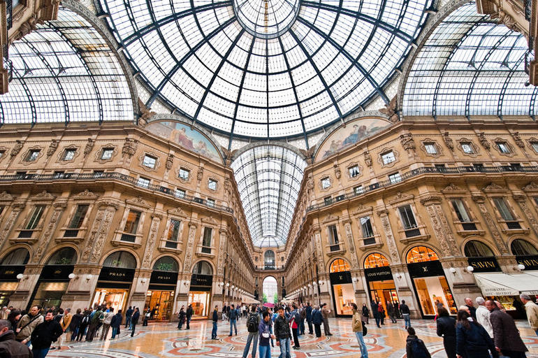


Circular windows,
Soft light shines through in the day,
Bright lights shine at night.
Sunday, November 13, 2016
The UK art museum many unique pieces. There was notable use of color in many pieces. The area had lots of light that was mostly artificial but it used a bit of natural light on the 2nd floor.

 These two pieces are contrasting in terms of form. The piece on the right is 3-D.

This picture is easily seen because of the lighting that shined directly on it.
 Artificial lighting is used to showcase the art work well.
 I believe this piece of Abraham Lincoln was made in the color black so that you focused more on the facial structure (the form) rather than the color of it.
 The contrasting shapes made this piece stand out to me. It has many intricate details and the dark black looks good against the white wall.
 I noticed these large cages had many different materials and colors in them. The contrast between the materials is what makes this piece interesting.
 A bit of natural light on the 2nd floor is shown in this picture. Natural light can change the brightness of colors and makes a room more interesting.
 It is important to note that the walls are all white. White walls help each art piece stand out. It allows no distractions from the main focus which are the art pieces.
 A bright neon color is used in the store to bring attention to the products. The green contrasts with the white as well.

The first thing you notice when you walk in is this colorful picture. In terms of scale, this picture is very large, probably to make you look at it.


This picture is easily seen because of the lighting that shined directly on it.


Thursday, November 10, 2016
The college of public health is a plain, boring building made out of concrete. The outside of the building is boring to viewers because the color is all the same, grey. An exception is the blue signs saying it is the college of public health, making it look even worse. When you walk inside you will see a brown wall and another college of public health sign. The contrast between the white and blue sign and the brown wall makes the sign stand out. There is not much light that shines through the building. In fact, the only natural light source in the front foyer are the glass doors. Throughout the rest of the building artificial light is heavily used. There is some color on the bench in the front foyer. The other colors are neutral such as white and black. The space itself is somewhat small making the visitor feel somewhat closed off from the rest of the world.
Tuesday, November 8, 2016
In the singletary center, the picture shows huge windows to the right, as well as windows off in the distance. The singletary center primarily uses light to light up the room. What's notable is the chandelier that was strategically placed somewhat in the middle of the room. Neutral colors are used which makes it likable for everyone. In the next photo you can see mainly the use of artificial light but there's also many windows. The windows allow light to come in which allows students to be more awake and alert. In the last photo, the newman center, I noticed only 2 small windows when I first walked in. I also noticed a bright red wall. The red draws attention to the figure that is placed in front of the wall. Artificial light is mostly used in this space. Also, the space feels small because of the short windows.


(http://www.kentucky.com/entertainment/visual-arts/article44603856.html)

Thursday, November 3, 2016
The first thing I recognize in Albers' work is the the use of color. One photo from the video is the one with blue boxes. The usage of different shades of blue creates a monochromatic scheme. Another photo that I saw in the video that stood out to me is the piece with an analogous and monochromatic scheme, as well as mixtures of tertiary and neutral colors. One of my favorite pieces is the one with black lines that zig-zag and cause your eyes to move very fast over the photo. He uses lots of lines in his pieces. The lines curve and/or cross and this creates movement. Albers also uses lots of shapes such as squares, circles, and rectangles in his work. But the most prominent thing about Albers' work is his use of color. Overall, color is one of the main ideas in his pieces.
Friday, October 28, 2016
I chose to do my apartment. The specific room I chose is the dining room/kitchen. In the first picture which is at night, you can see the smaller wall and wooden floor in front. The space is dark and there's only one overhead light on. This makes the table dark and the overall feel to the room is a bit boring and one may feel unproductive while working at the table. In the mid day you can see some light coming through the left side of the photo. The dining room is bright and you can clearly see the wall color and other surroundings. In the morning there is the most natural light coming through. This picture was taken with no other lights on. This room can be clearly seen without other lights on. Saving electric is a great thing to do in the morning and all day. You cant see the room off into the distance because there is no window in that room.


| Add caption |
Monday, October 24, 2016

Sunday, October 23, 2016

Thursday, October 20, 2016
A fairly new discovery and material of the 21st century is Plant-based polyurethane rigid foam. It is a new foam made from plants such as kelp, hemp, and bamboo. It can be used for insulation in homes, surfboards, chairs, and more. It is environmentally friendly and could help save money on heat/electric. New discoveries like this that help cut costs in homes and are environmentally friendly will change the future in good ways.
Wednesday, October 19, 2016


Almost every room in the house had a fireplace. Fireplaces were vital to warm the house. The fireplaces were anything but ugly. Each fireplace was a little different from the rest. The first fireplace I saw was the most elaborate. It was in a main room which is why it was so decorative. A lot of the fireplaces used marble or stone. You can assume that they were wealthy because of all of the fireplaces that had marble. The fireplaces ranged in their scale. The bigger fireplaces were put in more important rooms, while the smaller fireplaces were put in bedrooms.
Tuesday, October 18, 2016
This building is an example of modern architecture for a variety of reasons. One reason would be because of the use of metal and glass. The main point of this building is the glass windows. While the use of metal supports the windows and provides a sleek, clean look. It has a yellow pop of color on the windows. But, it doesn't have decorative details. Modern buildings don't have elaborate detail the way that older buildings do. Most modern buildings showcase windows the same way this building does.
Sunday, October 16, 2016
Stainless steel is a very common metal that's used in kitchens. It is used for microwaves, sinks, fridges, and dishwashers. It is stainless and highly durable. Stainless steel is used in architecture in a variety of different ways. Chicago's Home Insurance building was one of the first made with steel. Skyscrapers were made with steel so that they would be properly supported. Steel was the material of choice because of the durability and strength it has.
Sunday, October 9, 2016

Friday, October 7, 2016


This study area makes use of a smaller space. This space is long but not that wide so they used shorter tables to make the most out of this space.

This small study space is made more interesting by the floor's repetition of shapes. The desk is purposefully put in front of the window to let light in.
The bookshelf is relative to the size of people. Some books are a bit higher but most are reachable by people.
The space of Young Library is used well. When you first walk in you notice how big the library is compared to yourself. This indicates importance of the library. The use of light is also something huge for this design. There are computers for use throughout the entrance floor. These are a bit secluded by the use of large walls and smaller openings to get to the computers. There is also a very large mural on the wall. The size of this indicates importance and the size of it draws your attention to it.
The space of Young Library is used well. When you first walk in you notice how big the library is compared to yourself. This indicates importance of the library. The use of light is also something huge for this design. There are computers for use throughout the entrance floor. These are a bit secluded by the use of large walls and smaller openings to get to the computers. There is also a very large mural on the wall. The size of this indicates importance and the size of it draws your attention to it.
Subscribe to:
Comments (Atom)
The fundamental aspect of modern design is clean, open, and simplistic in nature. Modern design is very functionality focused. It also goes...
